
Readers will recall we produced a proposal for indicators for municipalities. A dashboard would help local politicians understand how the built infrastructure was affecting the living environment and how the environment was affecting society. The first proposal is illustrated below.
Using data from national sources, the following is a prototype of how a dashboard could look built using Google sheets. We used the indicator A1 as an example.
Finding the data.
The first step is to download the data available. Wholesale supply of of vehicle fuel into the municipality of Sandviken, Sweden, is taken as an example.
| Year | Diesel and Petrol wholesale,m3 |
| 2018 | 37825.3 |
| 2019 | 35701.3 |
| 2020 | 32652.6 |
| 2021 | 32261.1 |
| 2022 | 26566.3 |
| 2023 | 31057 |
Source: Statistics Sweden.
We then produced a graph that shows 1) Actual sales, 2) Projected sales according to national aims to be fossil-free 2045 3) a trendline for actual sales.

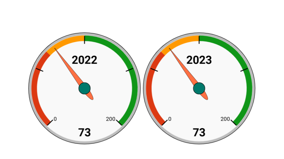
The next step is to construct trend lines. We chose to use the gauge graph for the last two years when data was available. We set the normative as the straight line towards zero in 2045. The score of 100% is calculated as follows.
Score = 100 X Current status / Status that should be to reach zero in 2045
So , if the data matches the normative, the score is 100%

The next indicator to try is A2: contribution of the local ecosystem to the CO2 balance in the municipality. For this statistic we chose the LULUCF statistic for the whole of Sweden as a proxy. (This could be developed as we know the area logged per year in the municipality, this figure could be used to improve estimates.)
The diagram below shows LULUCF CO2 emissions, as negative, along with the trend. We chose to make the normative the maximum sequestration achieved in the last decades (2010). We could have chosen the minimum (0%) as the lowest amount sequestered over the same period.

Discussion, the usefulness of the prototype
What we learn from this exercise: all three elements of the graph are useful as they show us that fuel sales are falling at a trend that is faster than the normative line of steady decrease to 2045. However, the last few years have seen a sharp increase from a previous low. The long-term trend is still within the normative.The gauges show that the year from last was under the normative, and the last year was just slightly above.
How does this visualisation meet the needs identified earlier in the paper? We identified the need as an indication as to progress against goals. Most important would be major deviations that require action.
In this test, it seems clear that progress against goals is shown. For example, although there has been an uptick in fuel sales, it is still on track to follow the normative. This would be useful for local politicians to see that one of the indicators is showing acceptable progress and there is no need for intervention unless subsequent years show the trend is moving in the direction away from the normative.
The carbon dioxide uptake by forests and land shows a negative trend. The figure of 75% – that is to say a shortfall of 25% – send a clear message that there is potential to better balance emissions if nature is better utilised. The next year’s figures will show if the trend is towards even less uptake. We can conclude that the visualisation is a vast improvement on simply showing the tables.
It is also positive that the dashboard elements were easy enough to construct in a standard environment, meaning that at least for this type of indicator, municipalities with limited resources could still construct useful

2 thoughts on “Experiments with prototyping a municipal dashboard.”